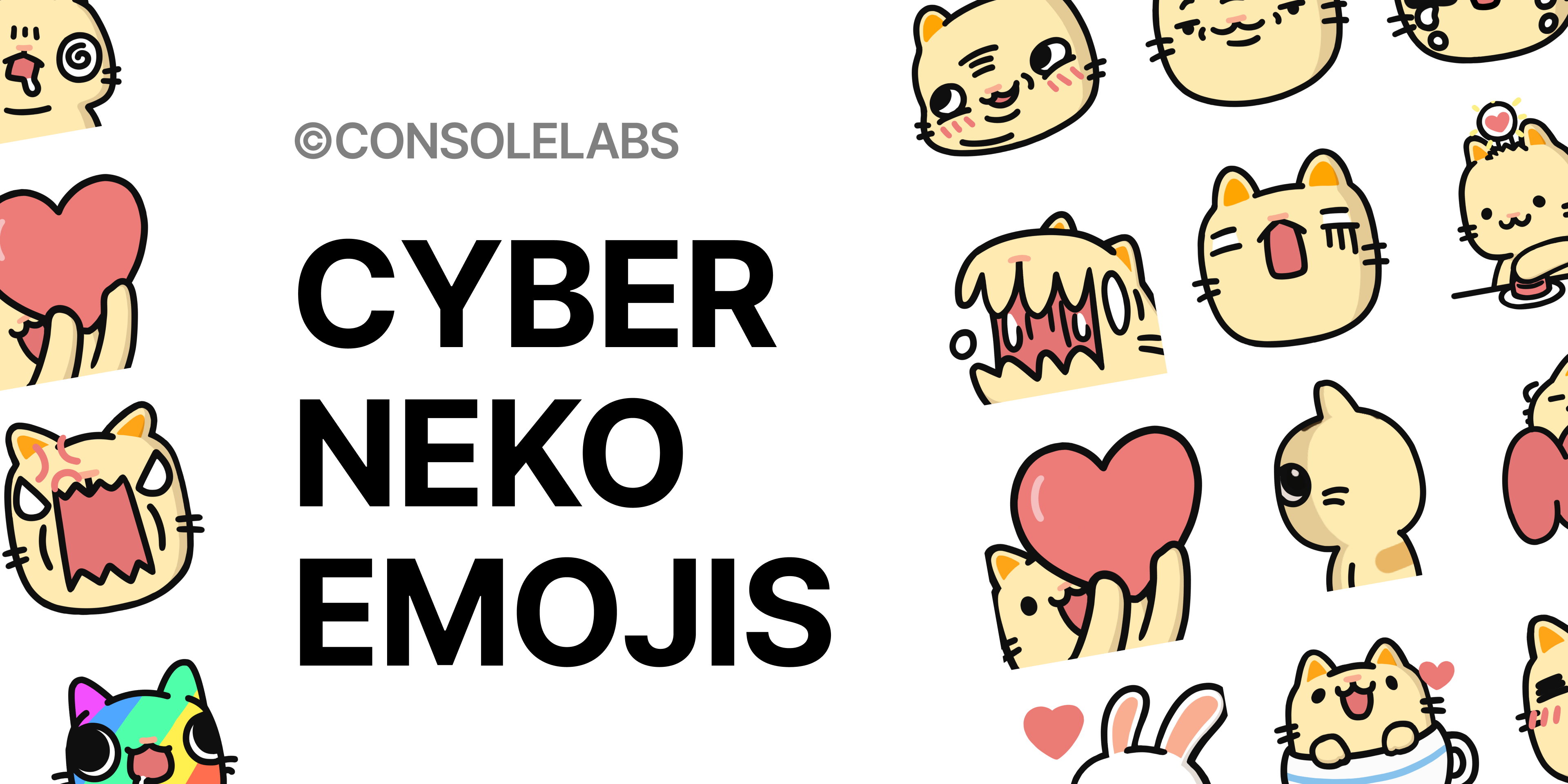
From Meh to Magic: The Emoji Revolution
In this bustling world of ads, we felt the urge to stand out. Everywhere we turned, a sea of brands clamored for a moment’s attention, but how many genuinely resonate?
That’s the journey that led us to Cyber Neko Emojis. We didn’t just introduce a mascot; we gave life to Neko, an emblem of heartfelt connection. It’s not about fleeting promotions; it’s about forging a deep, lasting bond. Neko isn’t merely a character; it’s a beacon amidst the noise, a symbol of genuine connections.
Where other ads might fleetingly grab your gaze, we designed Neko to linger in your heart. Because in that heart space, true connections blossom.
Setting the Stage: Meet Cyber Neko

So here we are, a bunch of creatives tasked with designing a captivating character that represents our brand in conversations with our audience. The aim? To make our messages not just seen but felt. We had Cyber Neko before, but let’s be honest; it didn’t quite have the pizzazz. It was like an unfinished sketch—promising but inconsistent, especially when it came to transforming from pixel art to vector.
Our Game Plan
So we sat down and hashed out what we wanted to accomplish:
- Sketch out the character’s concept and backstory.
- Zero in on an artistic style and personality that resonate with our brand.
- Opt for simplicity to keep the focus where it should be.
- Craft emojis that work across cultures.
- Design with versatility in mind, ensuring adaptability across platforms.
Breathing Life into Neko
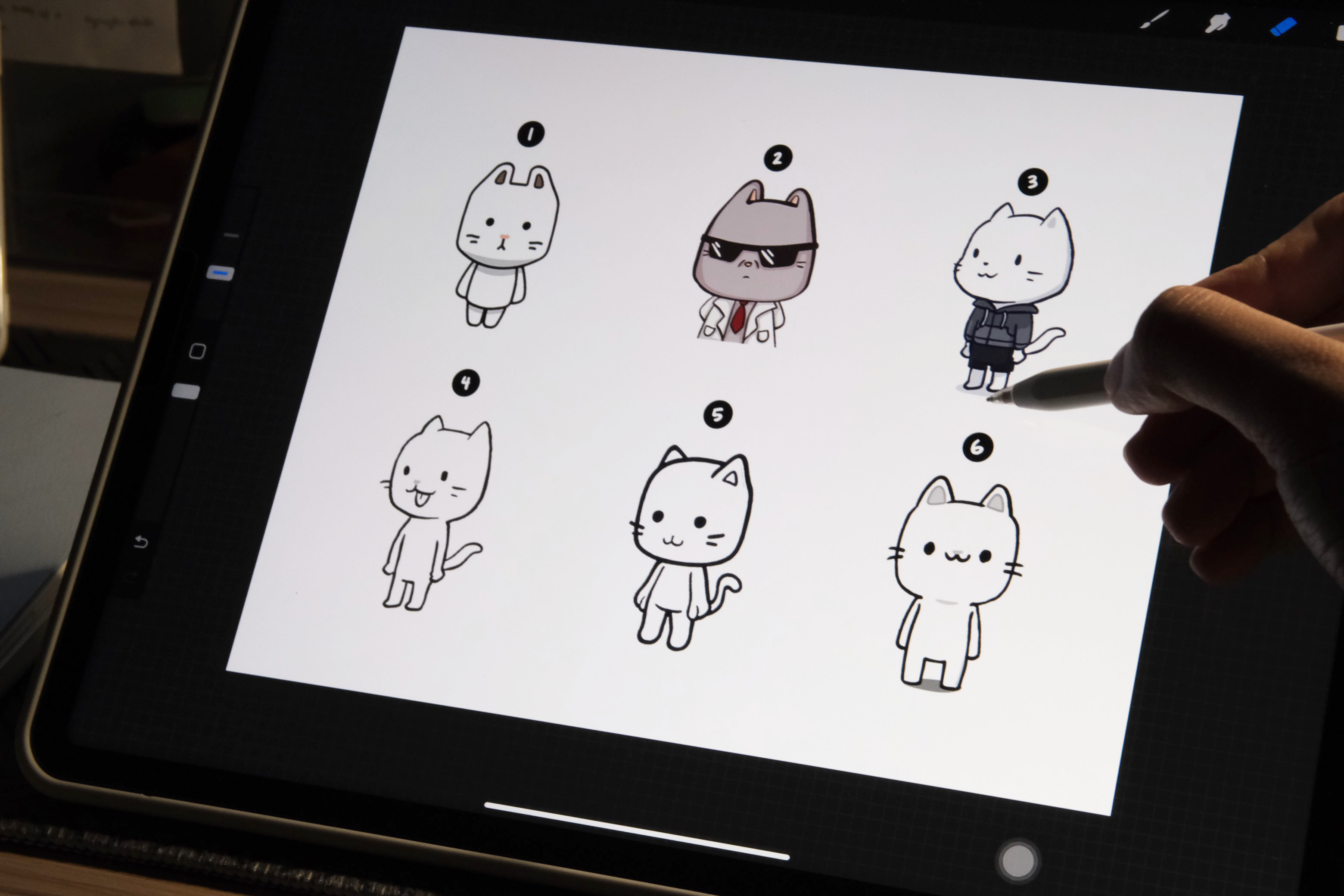
Designing a character isn’t just about doodles; it’s conceptual art. We needed everyone on the team to visualize the same north star. What’s Neko’s story? What’s the world where Neko exists? Nail these down, and you’ve got yourself a character that can be the face of a brand.
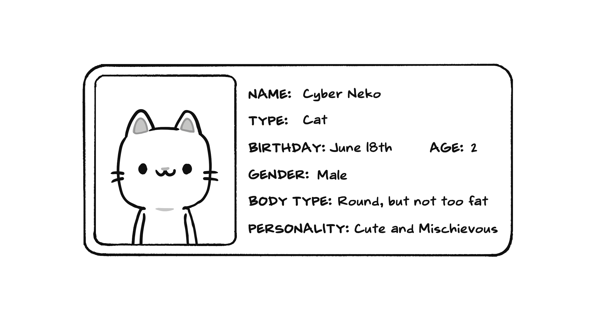
To get the creative juices flowing, we had brainstorming sessions, anchored by keywords and concepts. The simpler we could keep it, the more likely it was to stick and help convey the character’s traits visually.
Cohesion is Key
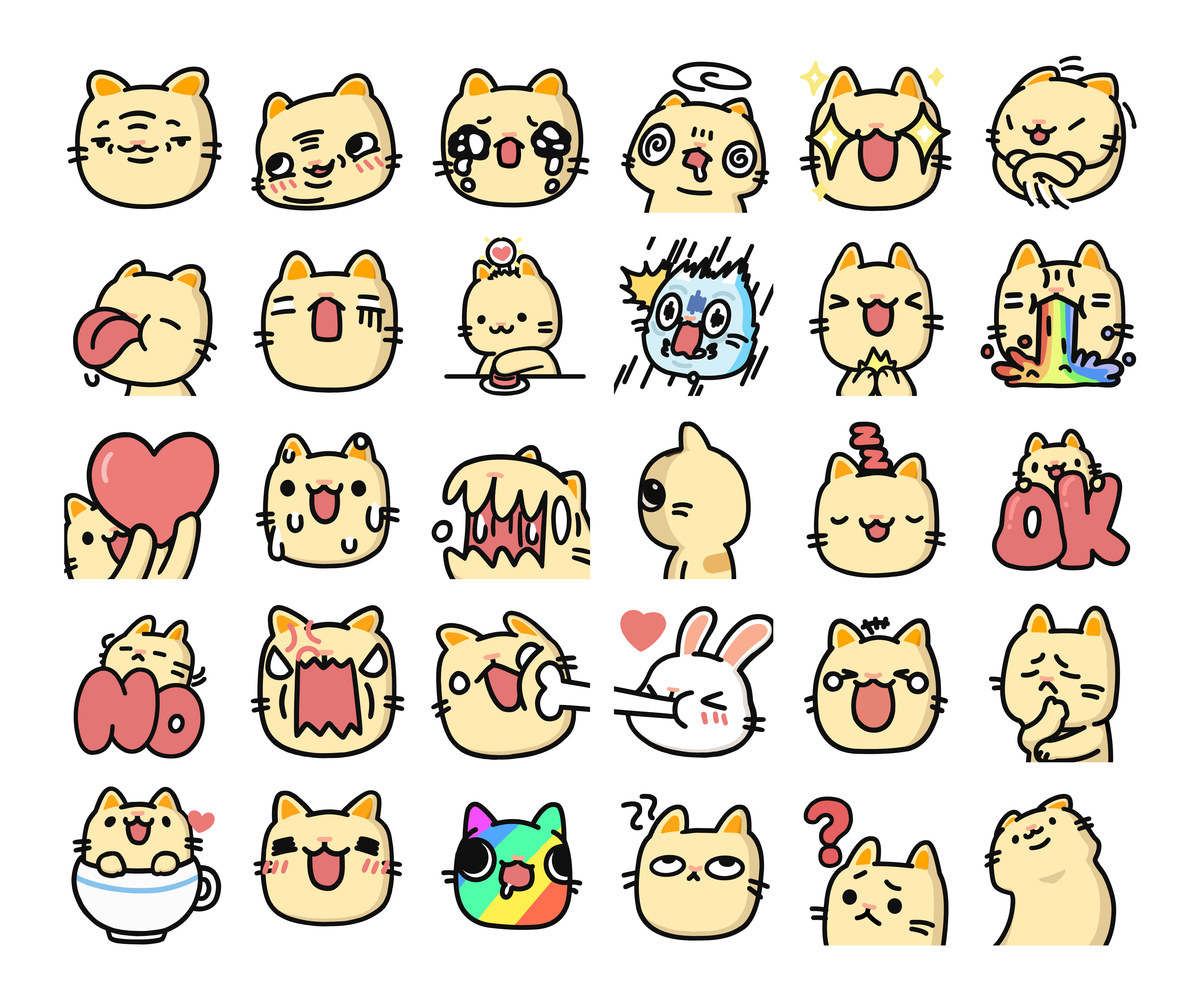
Now, designing a set of emojis isn’t a one-and-done deal; it’s an evolving process. Instead of dumping all our ideas at once, we needed a blueprint, a guide that makes sure the character and the design language coexist in the same emoji universe.
Less is More: Keeping it Simple
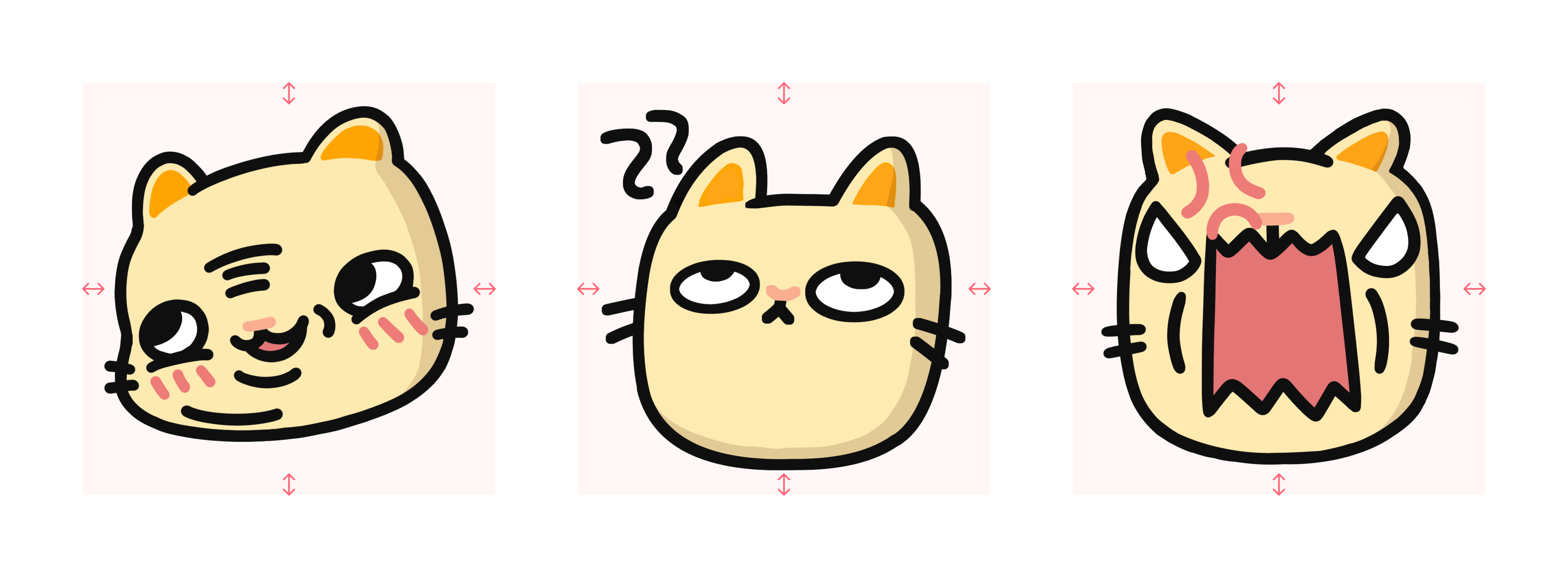
Emojis are tiny; they’ve got to fit within the confines of a text box. That means each stroke, each curve matters. Complexity? It’s just a distraction. We focused on the core features that would make Neko unmistakable, eliminating any excess that could cloud its essence.
Across Borders: The Universal Language of Emotion
Did you know that in the West, people focus on the mouth to gauge emotions, while in the East, it’s all about the eyes? Knowing our audience helped us make design choices that resonate globally, helping Neko convey emotions universally.
The Big Picture: Expand and Adapt
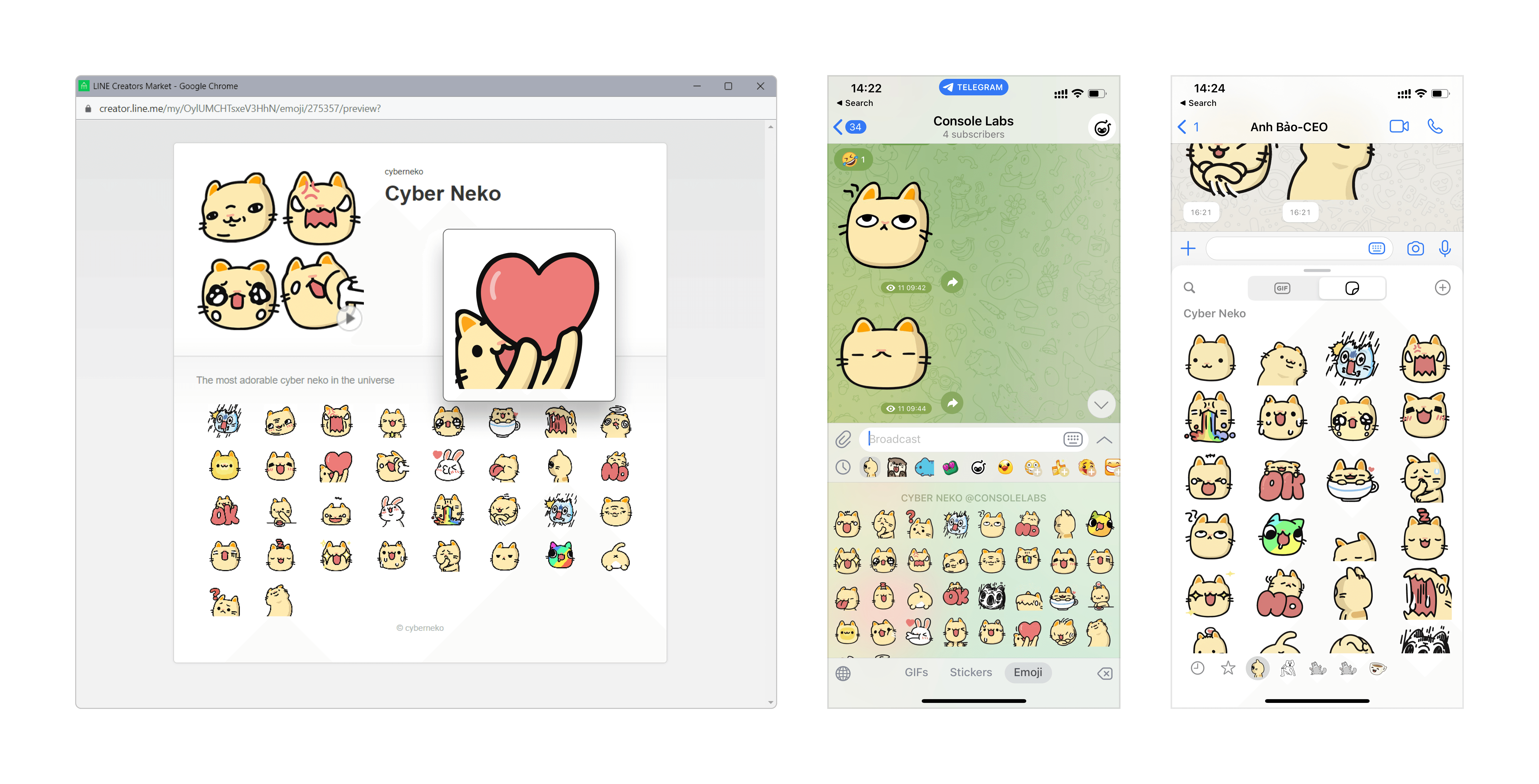
The ultimate goal was to make our emojis as dynamic and as personal as possible. While emojis can be whimsical or even silly, there are serious tech and limitations at play. So we tested different sizes and devices, ensuring that no matter the platform, Neko remained clear and easy to understand.
So there you have it—the journey of how Cyber Neko evolved from a lukewarm concept to a lovable emoji set that aims to make digital conversations a little more heartwarming. And let me tell you, it’s been a ride, a rollercoaster of creativity, and it’s one we’re all proud of.
